

You’re planning a webinar or online workshop and you’re looking for the best webinar graphics for marketing the event. You want to promote via email, your website, social media, maybe even paid ads — but before you spend all that time, money, and effort you want to design a compelling webinar graphic to include in promotion.
In this article we’ll show you the 29 best webinar graphics for marketing your event on any screen. Use these graphics as inspiration for your own designs or have a designer create something unique and specific to your brand based upon the ones you like best.
For the first several graphics you’ll find a bit of commentary setting up what we like about each graphic. You can use that feedback to come to your own opinions regarding the remainder of the designs.
There is nothing new under the sun so don’t put pressure on yourself to come up with something that is completely unique and different. At the end of the day, you want solid webinar ads and promotional graphics that communicate who you are, what you do in a way that resonates with the person you are geared to help most.
So let’s get started!
Updated Webinar Graphics
That’s right! We’ve updated this post to be more reflective of the current design trends. What does that mean for you?
First it means that you have new examples to inspired and educate whatever design you create.
Second it means that we’ll lead with looks that are current. This doesn’t mean that the original webinar graphics are irrelevant or useless. It simply means that you’ll notice older trends in the original list as well as timeless design concepts that are worthwhile no mater what year we’re in.
Bottom line… look at all of the examples as inspirational to help you arrive at your perfect design!
Bettermode — Webinar Series
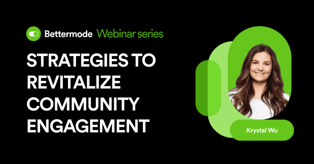
The Bettermode design is very clean, simple, and straighforward — in this particular image, the brand is the same plus a nice geometric shape which serves as the host graphic.
You could very easily delete the shape style and just use the pill type design for the photo. Very easy to duplicate.
- Landscape logo placement
- Clean title with plenty of space
- Room for a host photo with name
Proposify — Sales & Marketing Alignment 3.0
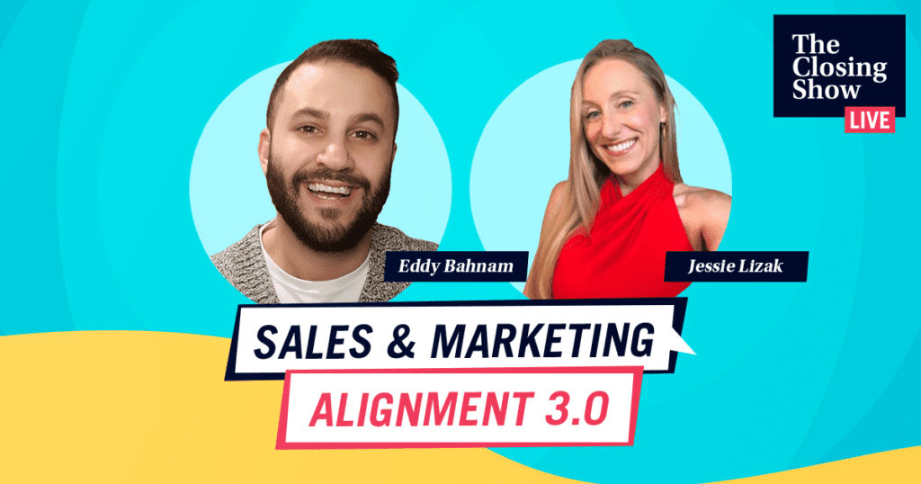

This is a fun spinoff design from the standardized Proposify Branding. The blue and yellow tones are included in the larger brand color palette but in this design they are the feature colors.
In addition, the webinar graphic does a great job of getting a lot of information on the slide without it feeling crowded.
- Show Name
- Event Title
- Speaker Images
- Speaker Names
- Design Elements
This is a great example of both a one and two-host event graphic and definitely worth drawing inspiration from.
Clearbit — Marketing Intelligence
Hard gradients have been ‘in’ in the past and today gradients are back but in a much more subtle and soft manner.
Clearbit is using this trending soft gradient style for a simple Title, Date, Host webinar invitation.
Something that is unique to this is a Zoom-ish icon next to the date and time which is a neat addition that isn’t seen elsewhere.
Great design that is simple to use and communicates with simplicity.
Our Original List of Webinar Graphics
1) Smokeball — Legal Productivity Software

This is a great graphic from Smokeball, a company that provides legal practice management software for small law firms.
What makes this design really pop is the custom branded background used. It provides a great dynamic feel without stealing too much from the information.
There are three colors used for fonts and two font designs—standard and uppercase.
If you have a well known speaker to your industry, having the photo & name section is a great addition and this graphic does a nice job of balancing the information with the speaker image.
Finally, the ‘Legal Webinars’ badge is a nice touch — especially if it is an element that they use across multiple brand images.
One critique, the branded background looks great — however, the number of patterns may be a bit distracting, so one thing to try differently would be to lower the opacity of the icons or to remove one or two of them.
2) LoginRadius — Customer Identity and Access Management

LoginRadius uses a very standard approach to their graphic — solid background, simple graphic, and light text on dark background.
The graphic utilizes one font with two styles — standard and uppercase. When it comes to the non-font design, this design utilizes an isometric graphic illustration to depict the webinar subject matter.
There are three total colors not including the illustration.
It is a very simple graphic and provides the information in a very straight forward visual.
One critique for this graphic, the spacing is not quite to our liking when it comes to how far the dark blue box pushes over to the illustration. One change to make might be to move “Authentication” to a new line and nudge the blue box to the left so there is more balance.
3) Frank Kern — 5 Steps to A Webinar that Sells
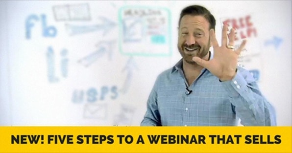
Frank Kern goes with a very simple graphic — photo, blurred background, and black on yellow text.
There is absolutely nothing wrong with this simple approach and Frank Kern is no slouch to follow after.
What makes this work is that it is a quality photo, interesting background (very relevant to his audience), and the title/text is very specific and catches the eye.
One critique for this graphic, there isn’t much branding to the image.
This particular graphic was run as part of a Facebook Ad so there is additional context provided which is something you would want to consider if you use this approach. If this graphic were to be used outside of the Facebook Platform, you may want to include the company logo.
4) Lewis Howes — Mastering the Secret Weapon for Growing Your Business… Hosting Webinars!

Lewis Howes produces a lot of webinars and does a good job of keeping up branding from image to image.
This particular graphic is used in conjunction with a Facebook Ad and foregoes providing any information on the design itself.
The organic color, the font, and the hand drawn arrows are all consistent with Lewis’ branding across many platforms.
Rather than an illustration, Lewis uses an engaging photo of himself — well lit with proper composition.
One critique for this graphic, if you were using this outside of the Facebook environment, you would want to include a logo or a name somewhere on the graphic to provide context. Possibly ditch the arrow and add a URL where the user could register for the webinar.
5) Neil Patel — Converting Prospects Into Paying Customers

Neil Patel is a long-time SEO expert and he produces a lot of free resources (like webinars) for entrepreneurs and online business owners.
His graphic is very simple, very clean, and very Neil.
His traditional color scheme is orange and you can see that in his name above the webinar topic, however, he uses a green color to better catch the eye. This graphic was used in a Facebook Ad combined the imagery with text for greater context.
The grey background includes a tiled look along with the filled-in green chart to provide a nice branded look.
One critique for this graphic, the ‘Sign Up Now’ call to action is a little passive — it could have worked to make that CTA filled or outlined as orange. Either way, this is a great graphic example.
6) Foxley — Design Business Coaching Program

Foxley is a platform that provides business training to graphic designers and illustrators.
There is a lot to catch your attention in this graphic — perhaps what draws the eye most is the headshot. The main title “How I generated 393 new website leads in 6 days,” leads the viewer to believe that it will be the man in the picture presenting — if you don’t know who the person is the image and title are less compelling.
The soft black glow across the bacground image combined with the yellow stripe is a very strong branded look and is definitely eye-catching. The Foxley logo is well-placed at the top of the image and the ‘Claim Your Spot’ button is a strong visual CTA.
One critique for this graphic would be to include the name of the subject whose headshot is featured along with the company they represent. That would bring more synergy to the overall communication of the graphic.
7) E-GMAT — Coaching & Training for Achieving Target GMAT Score

e-GMAT provides training, courses, and coaching to help students hit their target GMAT score.
This graphic ran in conjunction with copy to invite users to the webinar.
Overall, the graphic is very simple — text and image on solid background. This simple approach works well for those who do not want to hire a designer and have limited design skills.
There isn’t much by way of branding, and that is okay if the content or the company are well known to the audience. In this case GMAT is a very specific word that users will immediately know if the ad applies to them or not.
One critique for this image, something other than a straight black background might help to brand the image a bit more to the company, giving more authority and credibility to the ad through the image.
8) PropellerAds — Display and Mobile Advertising Network
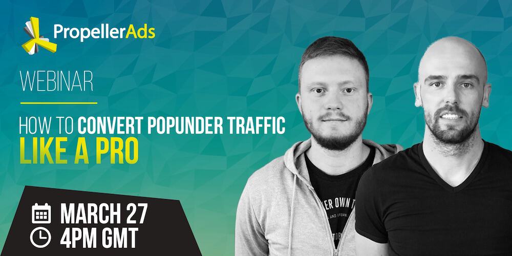
PropellerAds is an online platform that connects publishers and advertisers to create an alternative traffic source.
This ad utilizes a custom branded background along with a single font in two different weights. The color scheme is a direct lift off their brand and the logo connects the content with the company itself.
Like the Foxley webinar graphic, this image uses masked photos of two individuals.
One critique for this image would be to add the names of the individuals appearing in the graphic. This appears on the PropellerAds website where the webinar is available to watch and in the third paragraph mentions the names of the two individuals. A small text over of each of them at the bottom of the image would be a nice touch to complete the image and bring more context.
9) Leadpages — Getting Started with LeadPages

Leadpages is a landing page and lead capture SaaS that provides you with an online platform to capture customer information and connect it to a wide variety of CRM and email marketing platforms.
This ad is very simple, utilizes the Leadpages blue background, includes the Leadpages logo, and a CTA yellow consistent with their entire brand.
There are two fonts used with two colors total for great simplicity. You’ll also see a single image that has been poorly masked.
Though the image is a nice touch, the one critique for this webinar graphic would be to have a better masked image. Masked images are when you remove the background leaving the outline of only the primary subject of the image. Though we don’t know who the person in the image is, we can assume that it is either the presenter or a stock image representing their audience.
10) Amy Porterfield — Profitlab

Learn more about Amy Porterfield
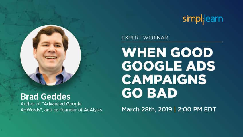
11) Simplilearn — Online Certifications and Training Courses for Professionals
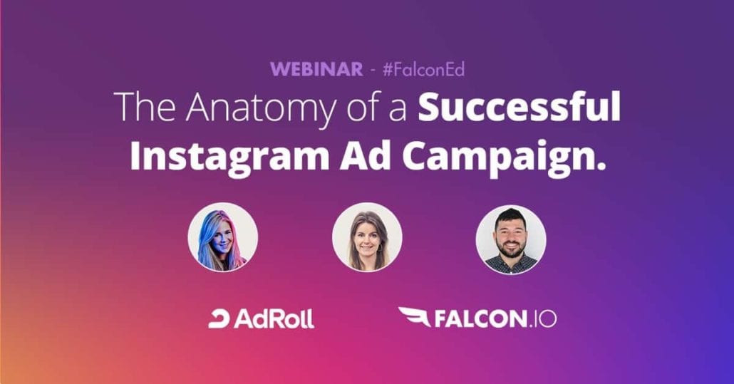
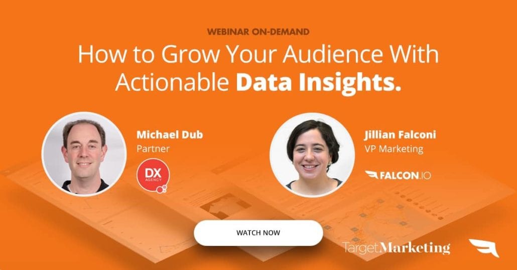
12) Falcon — Social Media Marketing Platform
13) Securicy — Manage Information Security & Privacy Compliance

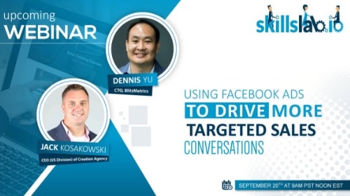
14) SkillsLab.io — B2B Marketing, Sales Training, Social Selling
15) Adalysis — PPC Management Software for Google Ads Optimizations

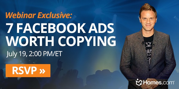
16) Homes.com — Home Search Engine
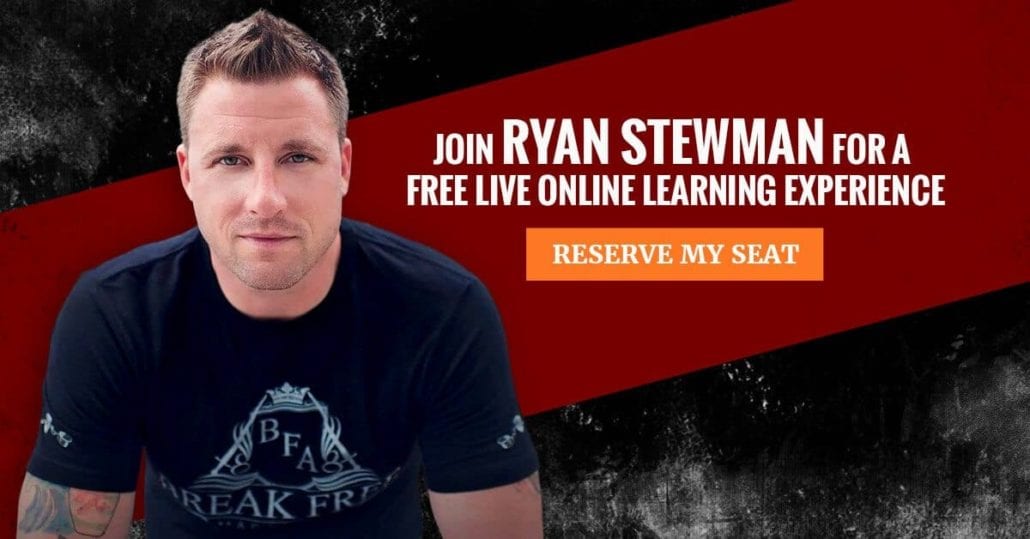
17) Ryan Stewman — Author, Sales, Marketing Expert
18) Search Engine Journal — SEO, Search Marketing News & Tutorials
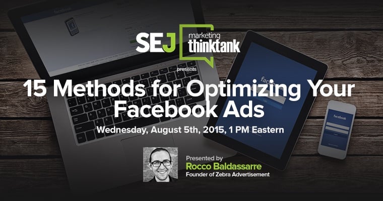

Learn more about Search Engine Journal
19) Automation Edge — Robotic Process Automation

Learn more about Automation Edge
20) SumAll — Automated Social Media
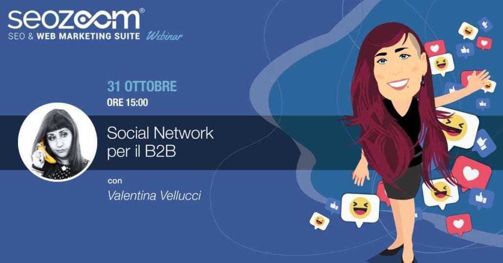
21) SEO Zoom — SEO & Web Marketing Suite (Italian)
22) Clarabridge — Insights from Customer Interactions

23) Spredfast — Social Media Marketing & Management Software

24) IBM — Developer Tools. Artificial Intelligence. Enterprise Technology. Solutions By Industry. Brands: Watson, Cloud, Blockchain, Services, Security, IoT.


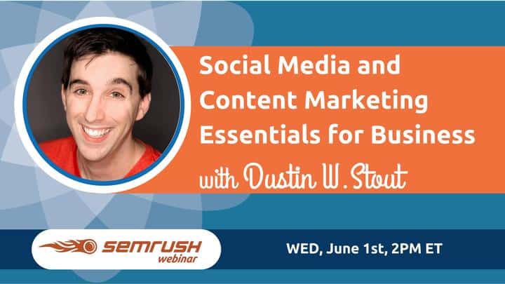
25) SEMrush — Online Visibility Management Platform
26) The Marketing Nutz — Social Media Agency Marketing

Learn more about The Marketing Nutz
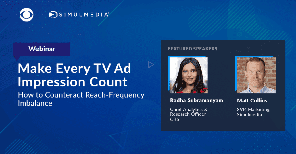
27) Simulmedia — Advanced TV Advertising
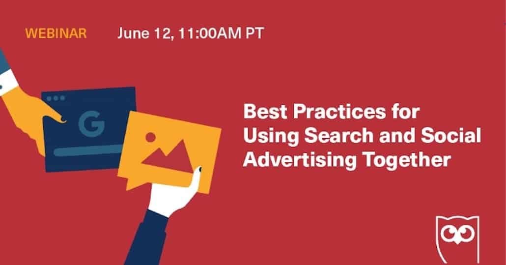
28) Hootsuite — Social Media Marketing & Management Dashboard
29) Campaign Donut — Content Marketing Campaign Training
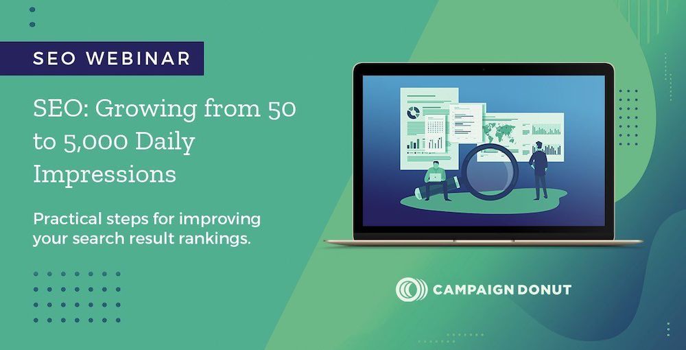
Click here to get this SEO webinar on demand
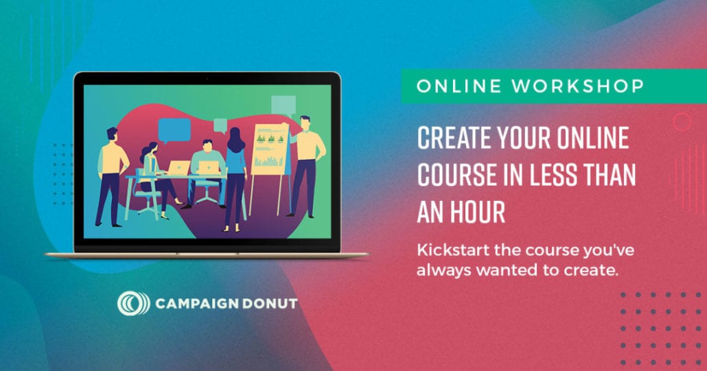
Click here for this online course creator webinar
These are two of the graphics our illustrators produced after we showed them our favorite images on this post.
30) Outreach — Sales Engagement Platform

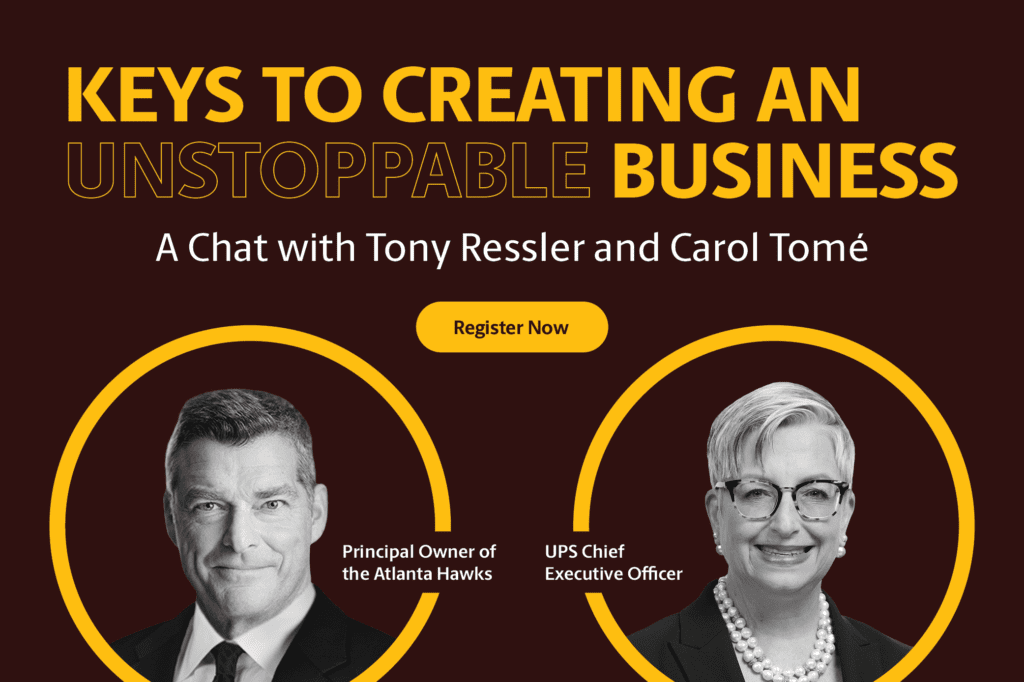
UPS — Shipping and Logistics
Final Thoughts On Webinar Graphics, Promotional Banners, and Ads
Regardless of what design you choose to use, the most important thing is that you actually launch your webinar. Don’t allow yourself to become hung up on the design.
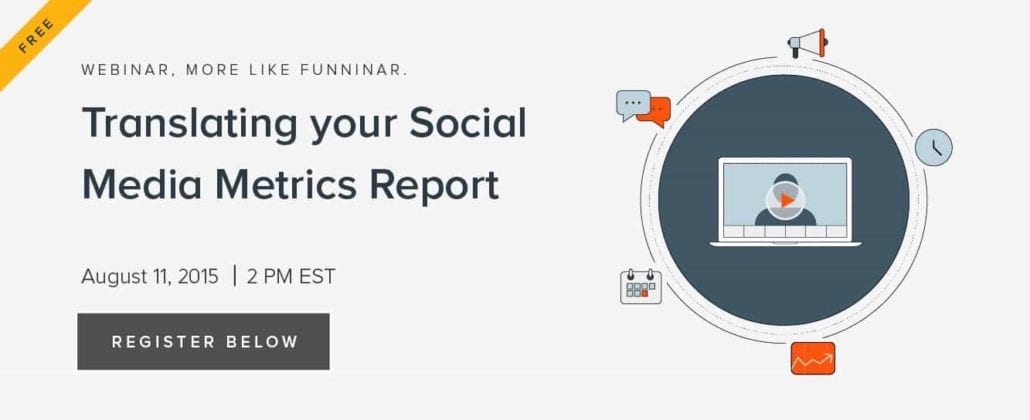
In our search for the 26 best webinar graphics we found LOTS of graphics that were simple with text on photo, just like these few examples below:


While these three examples may not be as attractive as our top choices above, they get the job done. If you have a webinar ready to go and all you’re waiting on are graphics — wait no more. Find a few stock photos that communicate the idea, throw some text on top of the graphic with the title and your business name, export your new webinar ad and start promoting!
If you are in a situation where those above you are demanding quality graphics but your hands are tied in terms of budget, consider finding someone to produce graphics for you through a service like Fiverr or even signing up for a low-end unlimited graphic design service.
Bottom line — the success of your webinar will hinge on the quality of your presentation and the clarity of your offer. Everything else just ads further support to these two pillars.
Questions?
If you have any question about creating your own webinar graphics and promotional ads send us a message or leave a comment below. In some cases we may be able to provide a quick solution, in other cases we may redirect you to another service or resource.